|
|
|
|
|
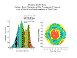
These two graphs display data from a study of dislocation densities on disk-shaped semiconductor wafers. The first graph is a histogram generated from data stored in multiple worksheets. The second graph is a scatter plot of the location of a measured value on the wafer.
Read
more... More of same type...
More by same keywords...
|